
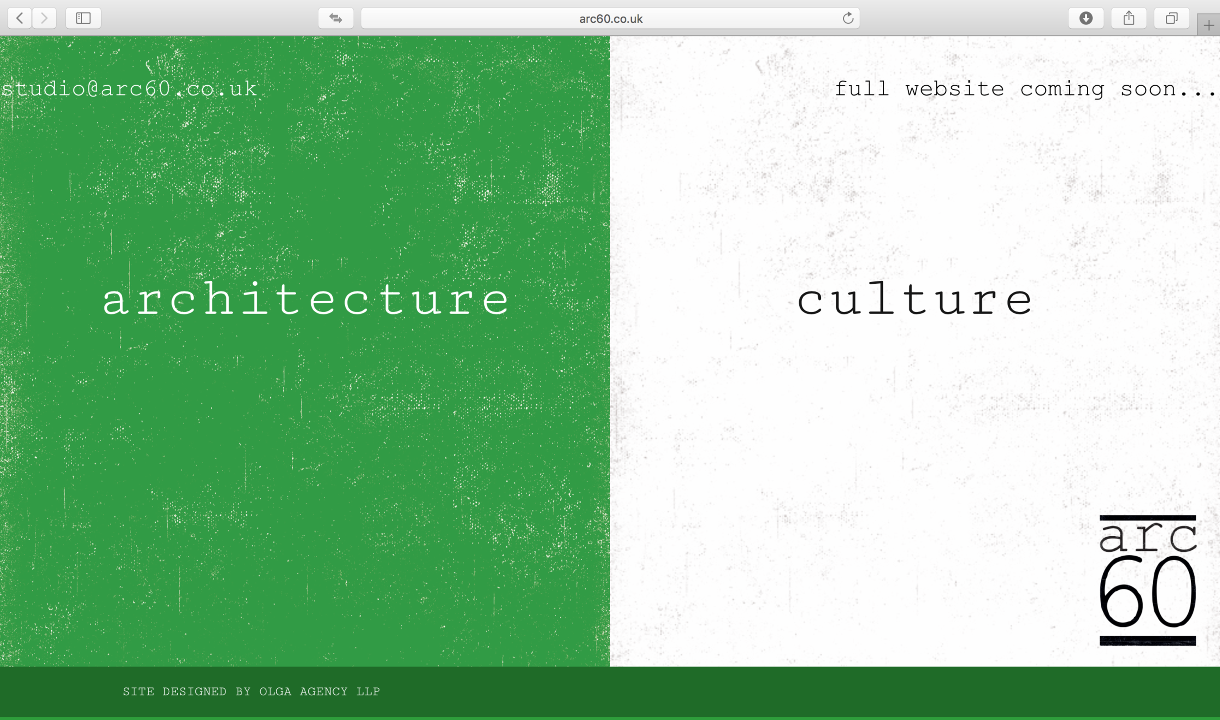
arc60 brand identity
A Hackney-based practice providing architectural services and cultural commentary needed a unique identity, that would be simple and yet show influences from a wide range of influences. Through OLGA, I provided a logo and look and feel that would work across a variety of media, including print, website, and RIBA signboards.


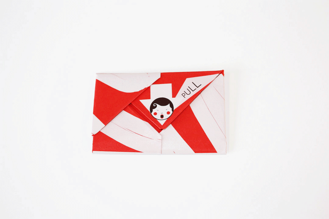
OLGA Brand identity
I'm the co-founder and Creative Director of OLGA, a communications agency with a focus on culture. Our agency mascot is a matryoshka doll, alluding to the multiple layers that go into a brand or communications strategy. The doll also brings the brand to life, giving it a highly distinctive, easily recognisable visual identity that makes people smile.
You can find out more about our work at www.olgaagency.com
Concept made tangible
A brand identity should be flexible. For our brand identity I chose a character that could be developed into an offline figure - a doll - and positioned in the office or presented to clients.
In contrast to the doll, we have a typographical logo that can be used when sobriety is called for.


Charm Offensive Logo & Visual Identity

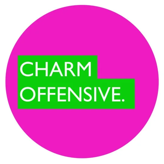
A company led by a showman, Charm Offensive’s logo needed to border on the offensively in your face, in contrast with the corporate style of the competition. The answer was a bold, marmite (love it or hate it) colour palette and logo.